Data format
Three functions are available to plot data distributions. All plot_ functions require a long-format data table as the first argument. Unlike other plot_.. functions, these three require the quantitative variable next (ycol) and then a categorical variable (Group). Repeat the name of the quantitative variable if there is no grouping variable or to plot distribution of all data.
Saving graphs
See Saving graphs for tips on how to save plots for making figures.
plot_qqline
This function allows quick visualisation of distribution by plotting a QQ (quantile-quantile) graph. It needs a data table, Y values and a grouping factor (if available).
plot_qqline(data = data_t_pratio,
            ycol = Cytokine,
            group = Genotype)+
  labs(title = "QQ plot",
       subtitle = "(`all_grafify` palette)")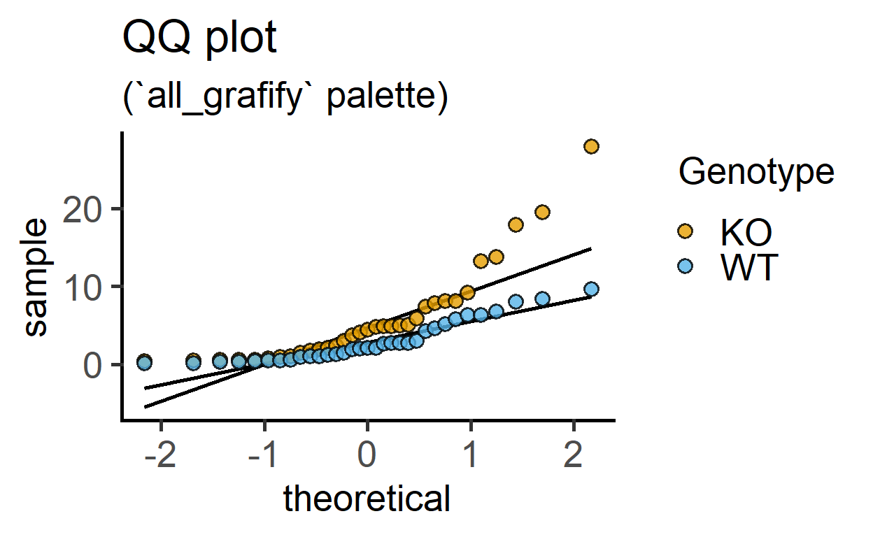
plot_qqline(data_t_pratio,
            log(Cytokine),       #log transformed-data
            Genotype)+
  labs(title = "QQ plot with log-transformation",
       subtitle = "(`all_grafify` palette)")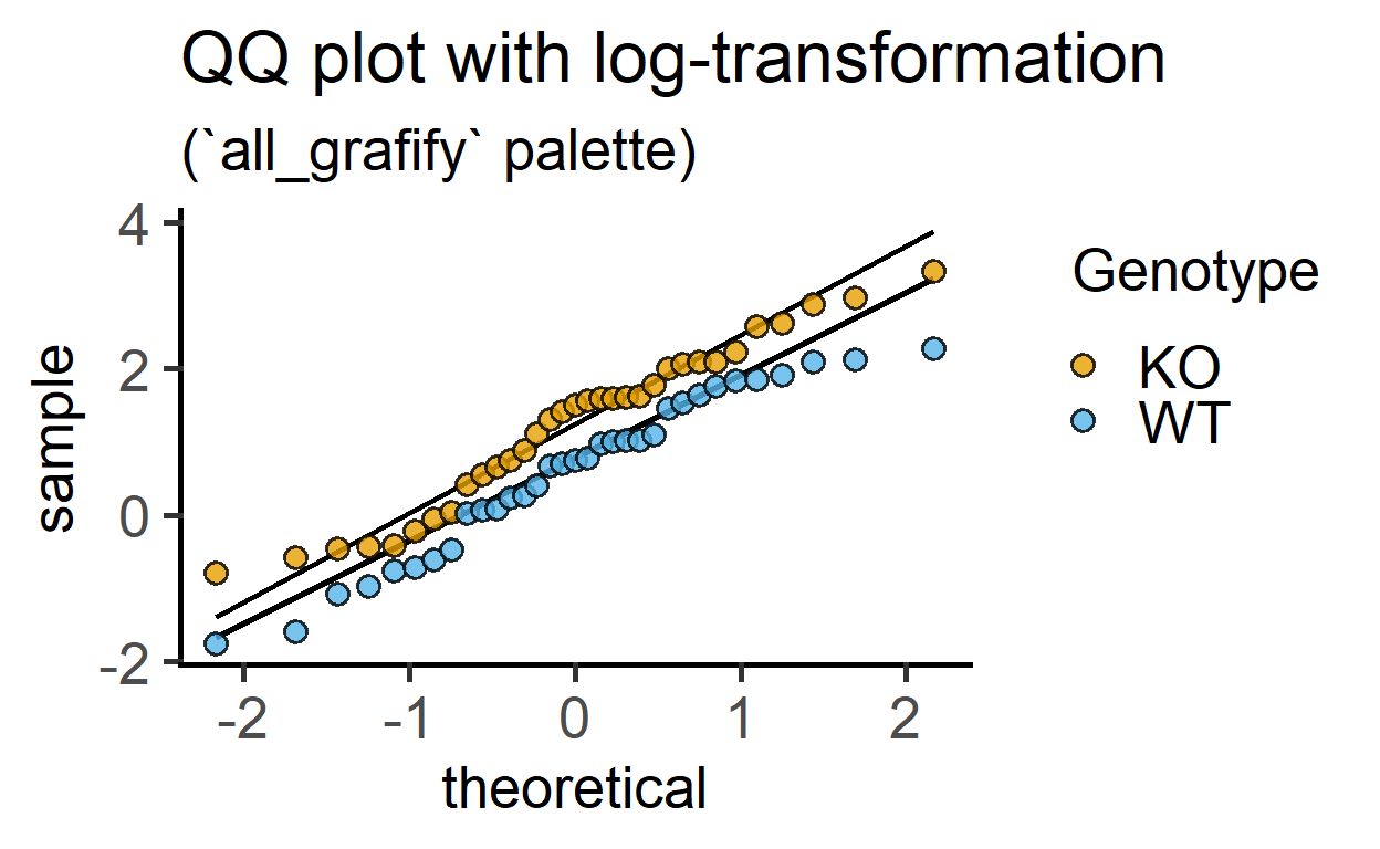
plot_qqline(data = data_t_pdiff,
            ycol = Mass)+       #entire dataset
  labs(title = "QQ plot of all response",
       subtitle = "(no subgrouping)")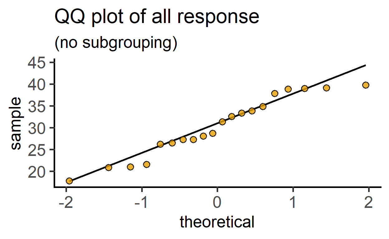
Data format
See the data help page and ensure data table is in the long-format.
plot_density
This function plots smooth density distributions using geom_density geometry. The example below uses the chicwts dataset in R.
plot_density(data = chickwts,
             ycol = weight,
             group = feed,
fontsize = 16) 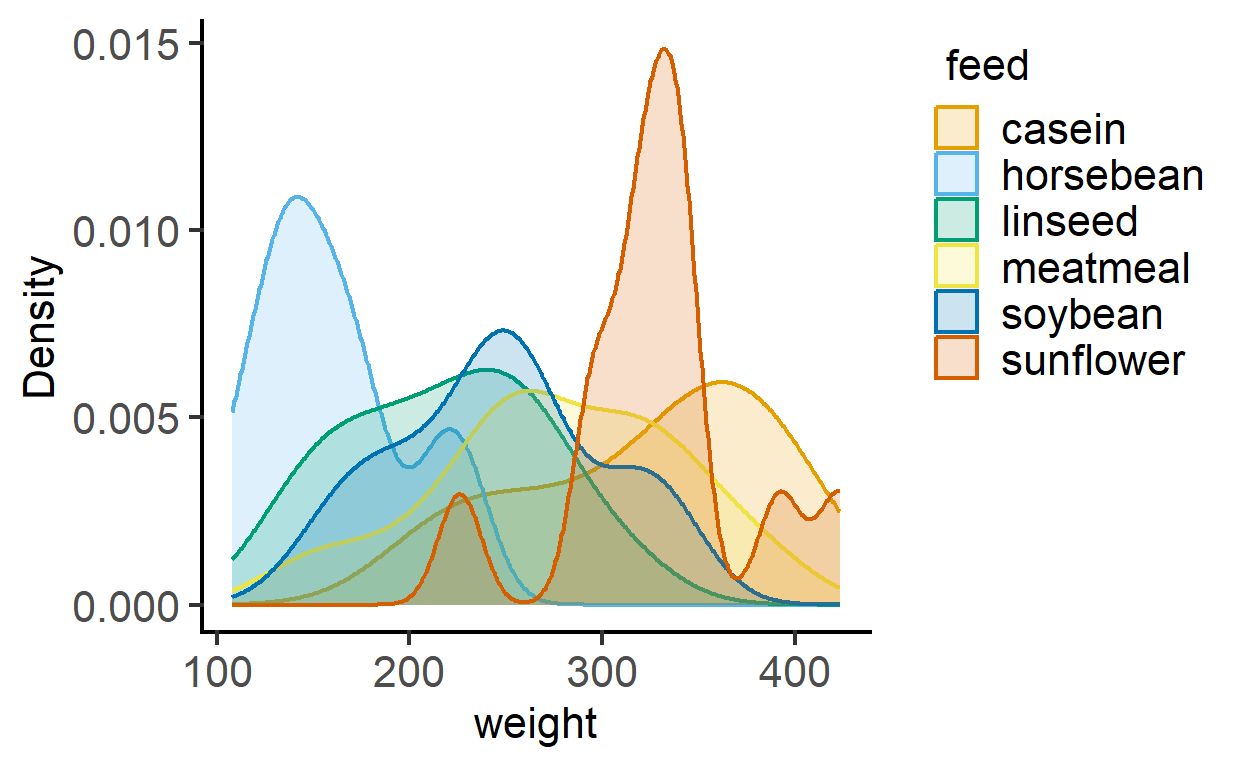
plot_density(data = chickwts,
             ycol = weight,
             group = feed,
             TextXAngle = 45,
             fontsize = 16,
             facet = feed) #with faceting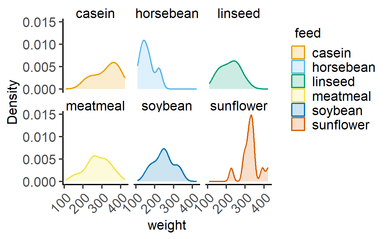
plot_histogram
This function plots histograms using geom_histogram geometry. The example below uses the diamonds dataset in dplyr. Change bin size on X-axis using the BinSize argument (default is 30)
plot_histogram(data = diamonds,
               ycol = carat,
               group = cut,
fontsize = 16) 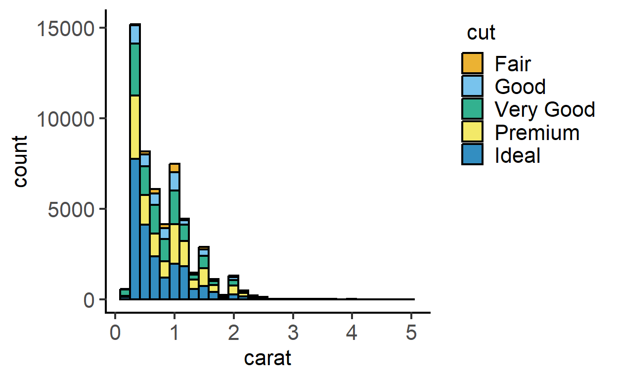
plot_histogram(data = diamonds,
               ycol = carat,
               group = cut,
               TextXAngle = 45,
               fontsize = 16,
               facet = cut)+ #faceting
  scale_x_log10()  #log x axis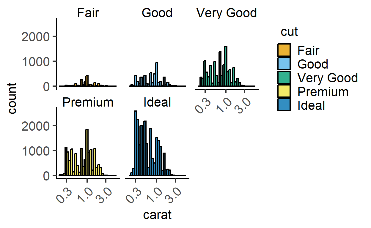
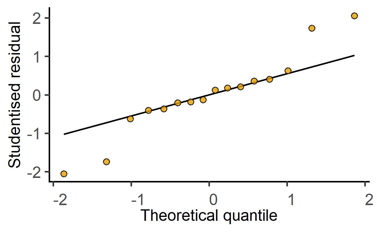
plot_qqmodel
New since v1.5.0: this function is for one-step plotting of residuals from linear models. It generates a Q-Q plot from model residuals for as a quick model diagnostic.
#generate a linear model
mod1 <- simple_model(data_2w_Festing,
                     "GST",
                     c("Treatment", "Strain"))

#get Q-Q plot of model residuals
plot_qqmodel(mod1)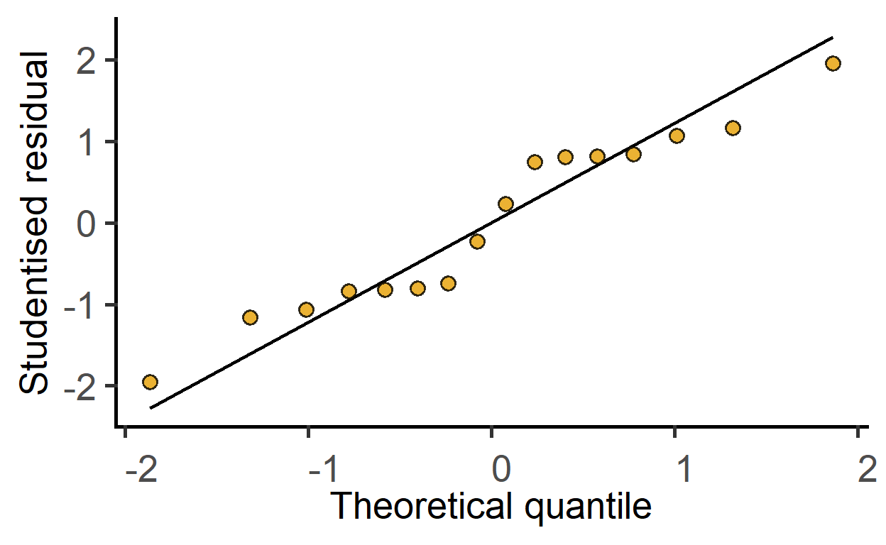
This also works for mixed effects models.
#generate a mixed effects linear model
mod2 <- mixed_model(data_2w_Festing,
                     "GST",
                     c("Treatment", "Strain"),
                    "Block")

#get Q-Q plot of model residuals
plot_qqmodel(mod2)